2008 11 26Painting Up There
I wondered how to paint "up there". It's easy once you know where to look :)
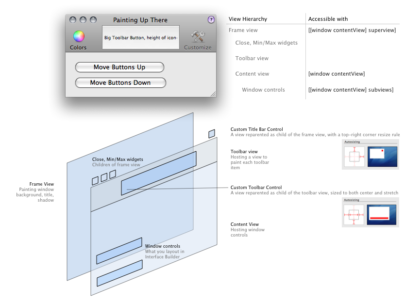
The Cocoa View hierarchy only talks about the hierarchy of controls in the content view, laid out in Interface Builder. That view hierarchy also extends up — the content view is hosted by a frame view which paints the window itself : background, title, shadow. That frame view is the parent of the window Close/Minimize/Maximize controls and of the toolbar show/hide control.
- Painting in the title bar retrieve the frame view with
[[window contentView] superview]and reparent your control with[frameView addSubview:myControl]. Why do that ? I never felt the help button in JSCocoa's console was well placed. Putting it up there seems to make more sense. As the toolbar is minimal and non customizable, the show/hide toolbar button won't be missed. - Painting in the toolbar retrieve the frame view and look for its child of class
NSToolbarView. Reparent your control to it withaddSubview. Why do that ? I wondered how iTunes paints its 'toolbar' controls. It looks like a toolbar on the right side, but the center HUD and left side play controls don't have labels. Why not use a toolbar to have the standard appearance and fill the missing parts with raw views ? Don't know if it's a good solution, but it works.
Sample Code ![]() Painting Up There.zip
Painting Up There.zip

Patrick Geiller
2008 11 27
Thanks !
I've always felt the title bar was underused. All that space for a tiny bit of text … that's a shame :)
Nice diagram! Very pretty.
I don't know if I would ever put a help button there in my own program but it's fun to see people try things just because it can be done.