2008 07 04Clickable Disabled MenuItems
There's been some talk about menu items at Joel on Software and ignore the code. If a menu item refers to an action that can't be done right now, should the menu item be :
- disabled : the default. You can't click it, you don't know why.
- active : click it and show an alert explaining why it can't be done.
- disabled + tooltip : a short delay hovering the disabled item will explain why it is disabled.
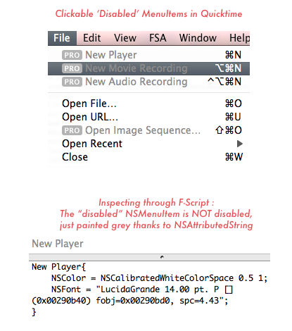
And the fourth option, that you all remember when trying to go fullscreen with Quicktime :
- active but greyed out : the menu item can be selected, clicked (it will then show an alert), and it looks disabled !

Let's launch F-Script and see how it's done : NSMenuItem uses a default font and color, but you can customize it via NSAttributedString.
validateMenuItem: : always return YES, and change the NSMenuItem color when it should be disabled.
Patrick Geiller
2008 07 04
Yes, it's really a nice solution. It's too bad that Apple is using it to nag you into paying for more software instead of using it as help.
One nice example of this mechanism as help would be in Pages, for 'Instant Alpha' : its activation is not obvious — it only works on an image selection — and opening a window explaining that would be nice.
I think this really is the solution to this problem. It is obvious at first look that the menu item is disabled and thus the user knows that it won't work right now. The "PRO" label also tells the user that they need to purchase the pro version of the application to enable the functionality, and if they need more info about it, they can just click the menu item.
Once more, Apple solved the problem before we even knew there was one.